The imagitarium rebrand almost didn’t happen. When I was tasked with being the design lead for a line expansion it became clear to me that a redesign might be needed.
Multiple vendors with vastly different printing capabilities had to be considered. Also, a modest budget made it impossible for the legacy design to be printed consistently for the new line extension. The legacy artwork’s primary identity was anchored by a gradient, and that was a huge challenge for some vendors to print.
Imagitarium: Legacy
The legacy design proved to be a challenge to print consistently and was a difficult design to place on some packaging structures. It was also clear that as the brand expanded, the arbitrary category wayfinding and navigation was confusing and inconsistent.
When I sat down to try to come up with an elegant solution to tie it all together, I got the news that some of the printers simply could not print the gradient. I thought to myself “what if I just… removed it?” A cascade of other elements were also removed or updated. That’s when it hit me. It felt like the natural course of action was to clean the slate and completely retire the dated legacy design.

Rebrand
I proposed a completely new look. One that was clean and minimalistic, with a template that could be easily adapted to almost any packaging design or budget. The redesign was approved and is now featured in-store at all Petco locations across the nation.

Rebrand: Color System
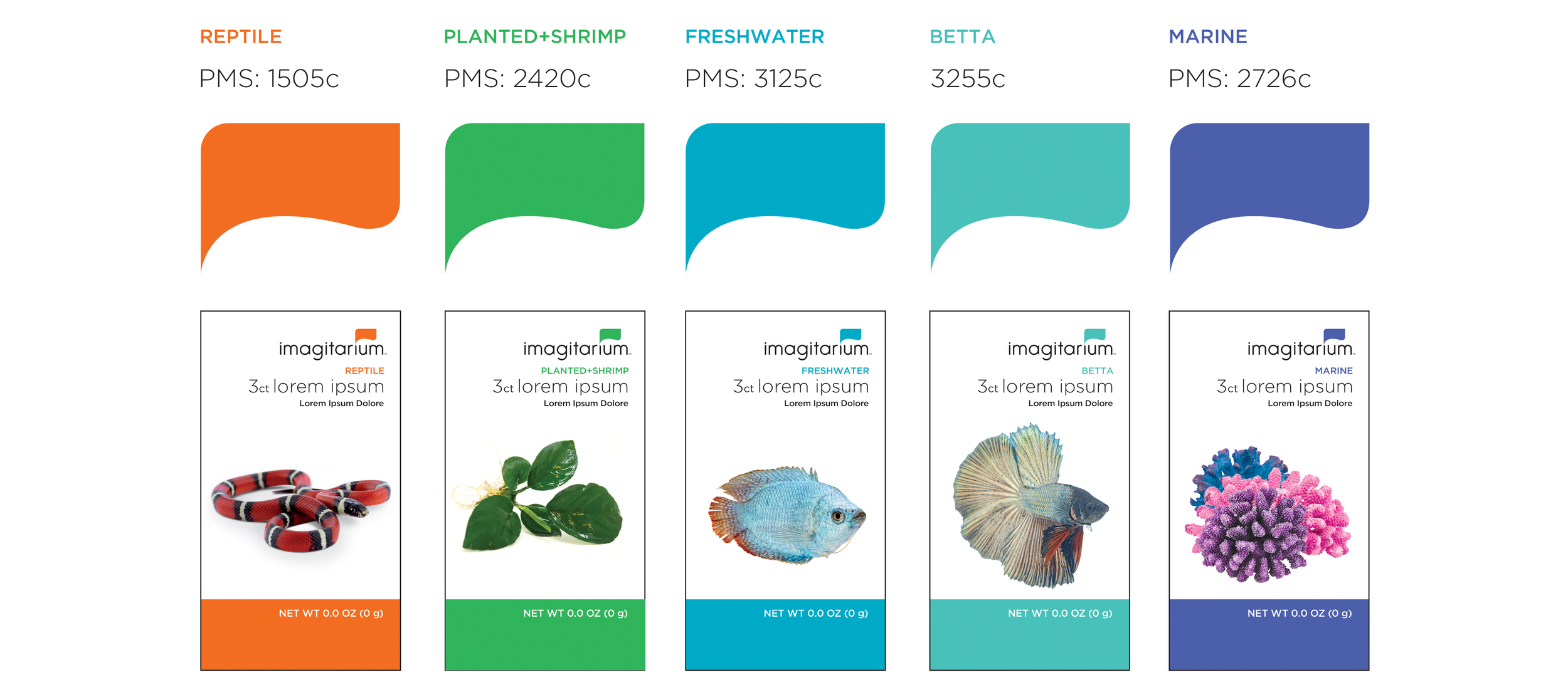
A color system was carefully considered and mapped out for current and future line considerations.

Rebrand: Collection
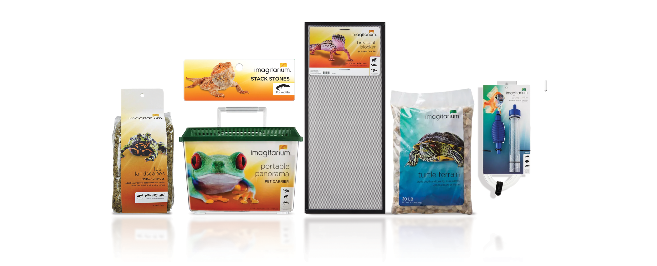
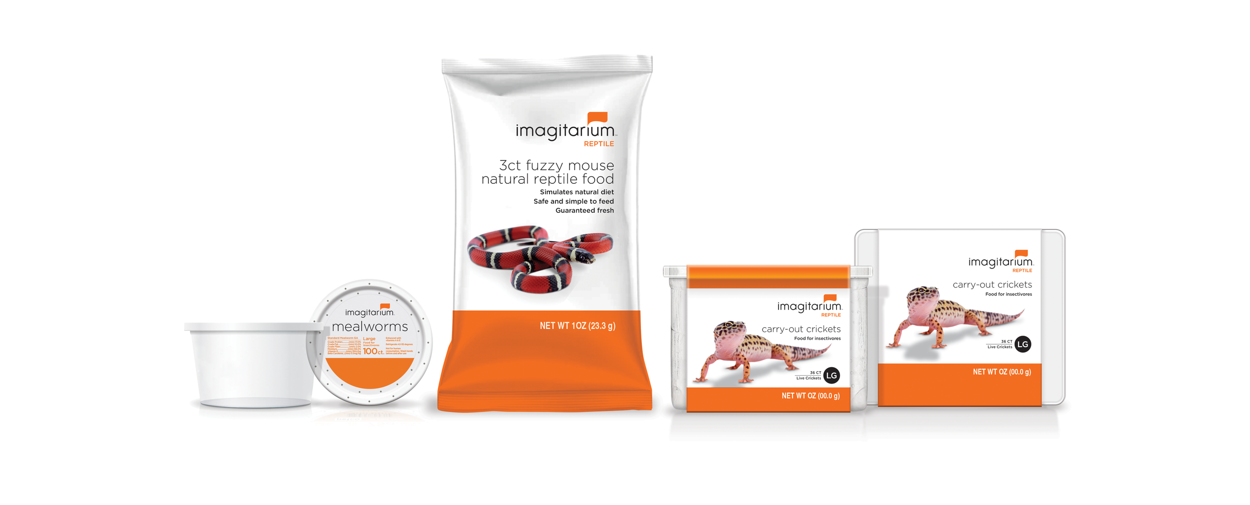
Vibrant color anchors the negative space, complimented by eye catching photography. Simple, clean, and versatile.
Planted + Shrimp

Betta

Reptile

